Project Objective
Our goal was to overhaul the client onboarding journey within the tightly regulated domain of leverage trading, aiming to enhance the conversion rate from user sign-up to first trade.
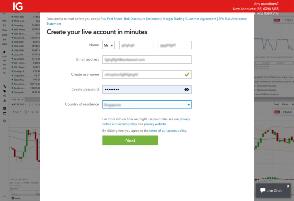
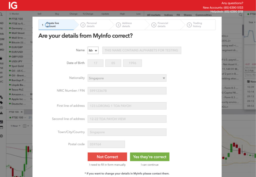
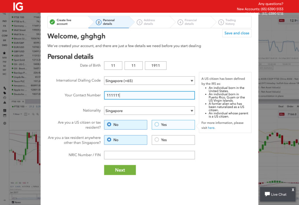
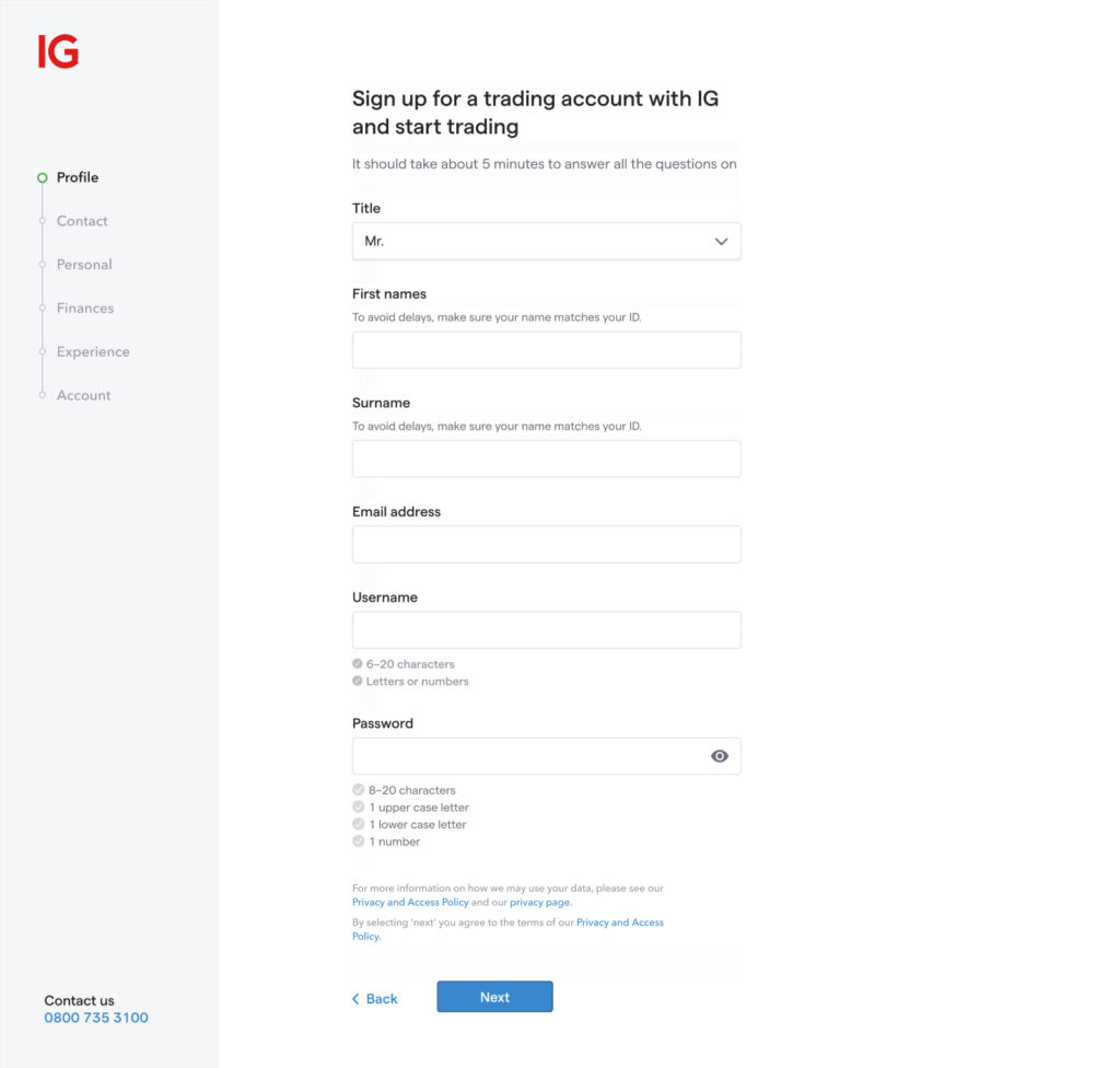
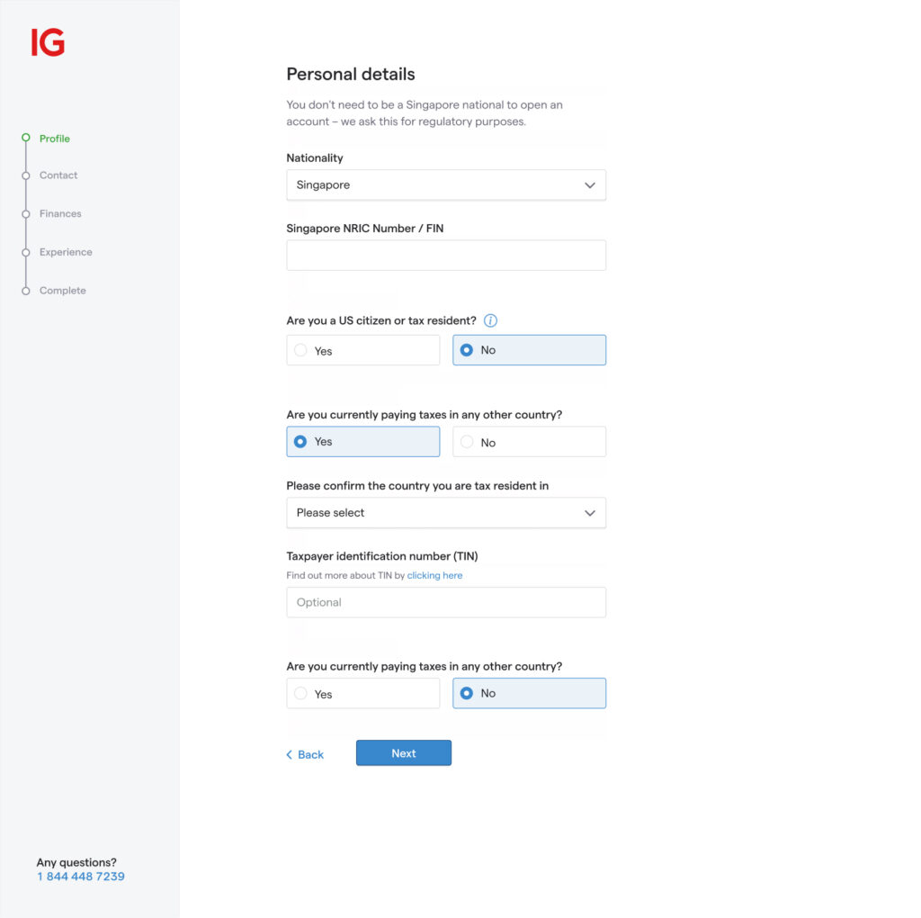
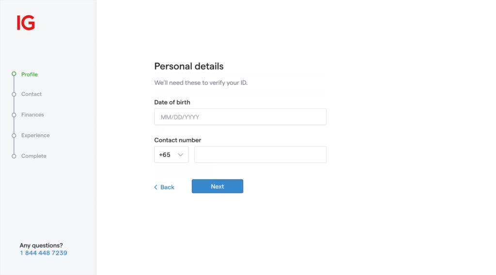
Original application forms
The Challenge
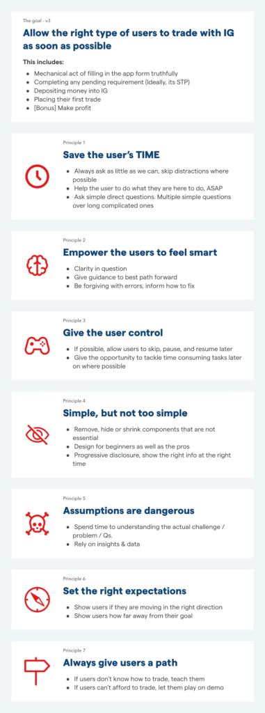
The project embarked on a critical question: “What if becoming an IG client was simple and straightforward?” This led us to meticulously scrutinise every interaction and touchpoint that a prospective client encounters on their path to becoming an active IG user.
The task involved collaborating intimately with experts in legal, compliance, business, and technology fields to thoroughly comprehend the rationale behind each inquiry posed to users and its potential benefits.
One formidable challenge was the necessity to tailor this journey for different global markets, initiating with the UK and extending to Australia, the US, and Japan. Each of these markets presented unique regulatory and cultural hurdles.
Over two years, we conducted more than 25 client interview sessions with prototypes of varying fidelity and carried out over 30 A/B tests. This thorough process entailed analysing extensive quantitative and qualitative data to pinpoint improvements that would elevate the customer experience. No stone was left unturned; we even re-evaluated optimal responsive breakpoints based on analytical data.
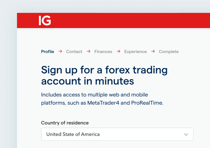
V1 Designs
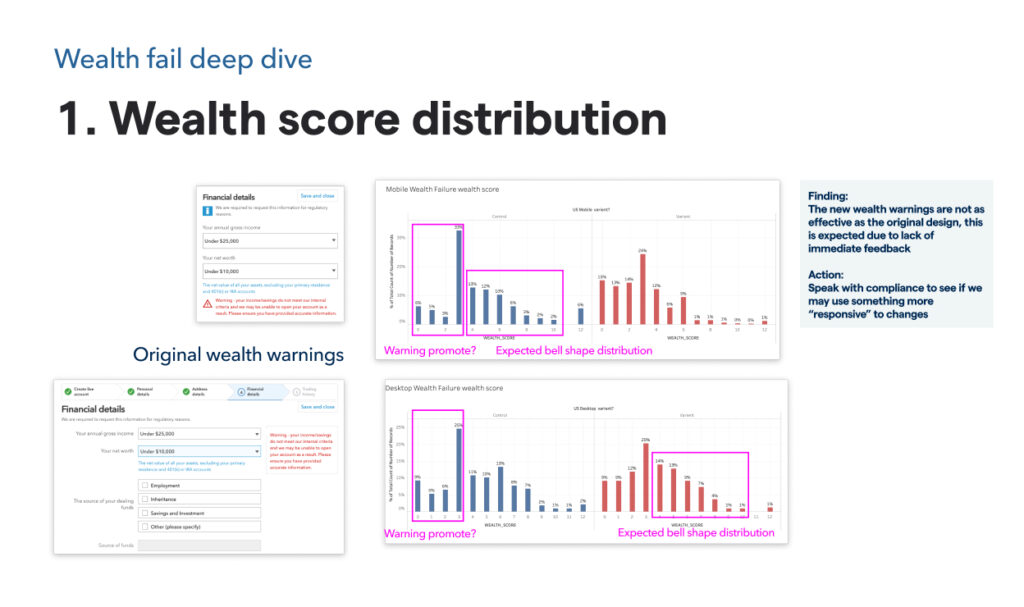
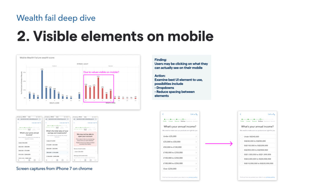
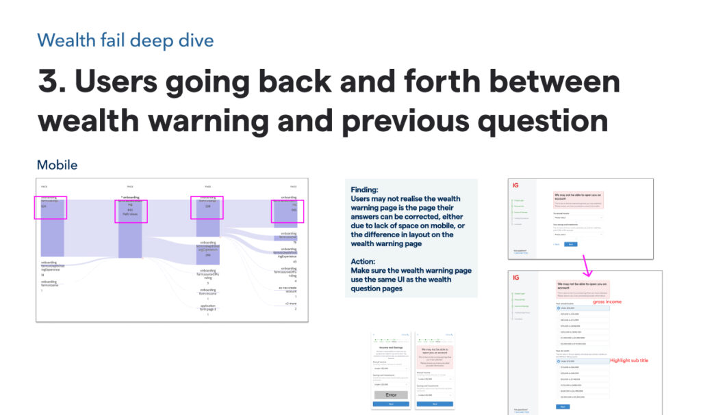
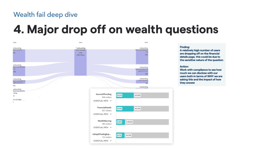
Some of the data we explored
The Outcome
Our systematic approach to customising the journey for each market involved extensive review sessions with local stakeholders and subject matter experts.
A key insight emerged regarding the variance in user behaviour across mobile and desktop platforms. We found that adopting a “One question/theme per page” strategy significantly improved mobile user engagement, as it streamlined the process of navigating through questions. Conversely, desktop users preferred a scrolling interface that allowed for answering multiple questions on a single page, demonstrating a clear preference for less clicking and more scrolling.
The implemented improvements encompassed comprehensive aspects, from reevaluating the regulatory necessity of certain sections to optimising the UI components for each question.
The project’s success was unequivocal, marked by a projected annual revenue increase in the six-figure GBP range, showcasing the profound impact of thoughtful UX design on business outcomes.
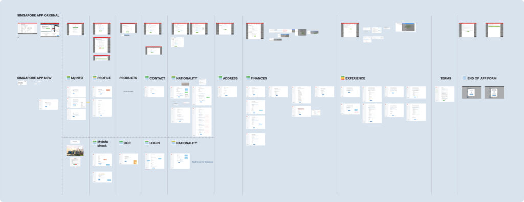
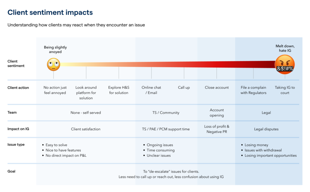
Other artefacts
Lessons learnt
Following the successful project launch (e.g., increased user sign-ups and ways-of-working), I created a presentation to share the challenges and valuable lessons learned with the design team.

