Context
Investors today naturally expect to be able to keep track of their investments on the go. Floww already had a great website for investors, but it’s very focused for the desktop and . The job to be done while someone is out and about versus sitting at their office computer is naturally different. We believe for the former its about making decisions about investments while on mobile, its more about keeping track of your existing investments on the go, reassuring the user their money is OK. This is why it was important for us to design a mobile app specific to investors who uses Floww.
The Challenges
I was bought in to the mobile team just after the launch of our very first app, it was focused on the technical challenges of expanding from a web only to a multiple platforms, it was developed with basic native iOS components, and my role was to help work closely with subject matter experts, product manager and developers to decide which aspect of the app should remain as a native component and which we should further develop and customise.
It also involved working with the creative director and other designers to establish the right level of branding without an overwhelming colour palette that both the design and development team can work with systematically.
The project required a steep learning curve to understand the intricacies of private equity work and funds. Collaboration was key; I worked closely with product owners, business analysts, and developers to craft an exceptional app. A significant challenge was the tight timeline, which necessitated strategic decisions about design and development priorities.
Often, we had to strike a balance between whether to design features that catered to the majority of users or to focus on functionalities that served a smaller segment of high-value users. This required a careful balance of business needs with the optimal path forward. Moreover, aligning design ambitions with development realities within the time constraints was critical. I engaged deeply with developers to scope out each feature, ensuring that our design visions were practical and could be brought to life in time.
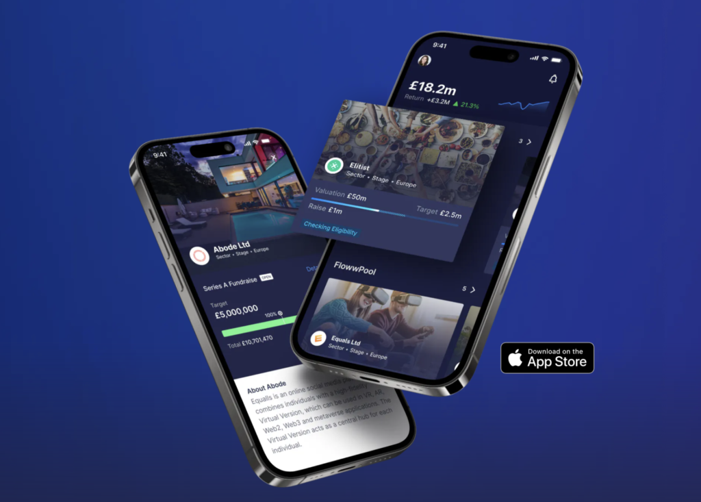
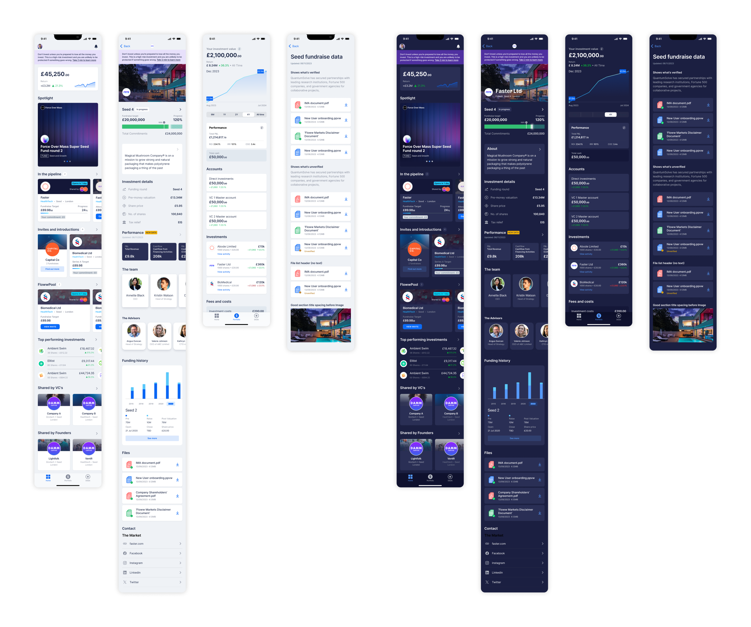
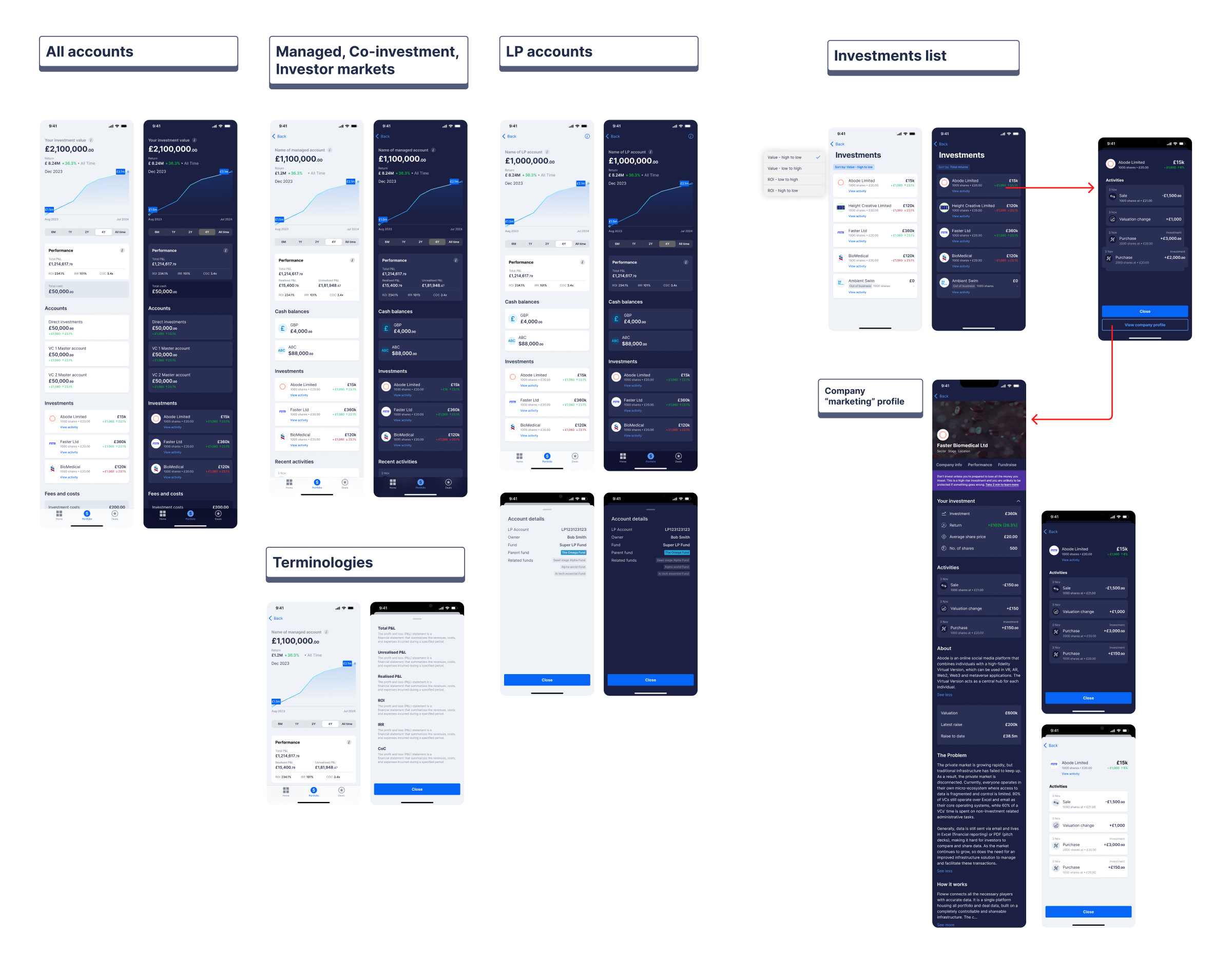
Investor Portfolio
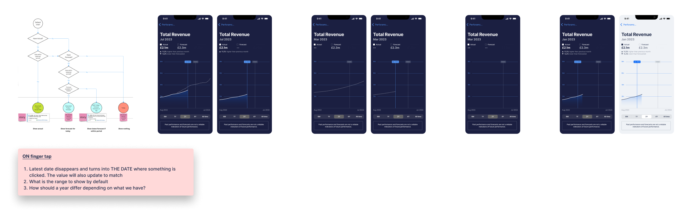
Performance charts
One of the more complex aspect to the app is how should a user’s invested company data be surfaced, the web interface had highly customisable interactive charts, working closely with product manager and developers, we had to decipher what was available from the server, and design the interface to surface just the right amount of data for analysis on mobile device. One of the challenge is the data exists in multiple layers, total revenue, can be clicked through to various revenue streams.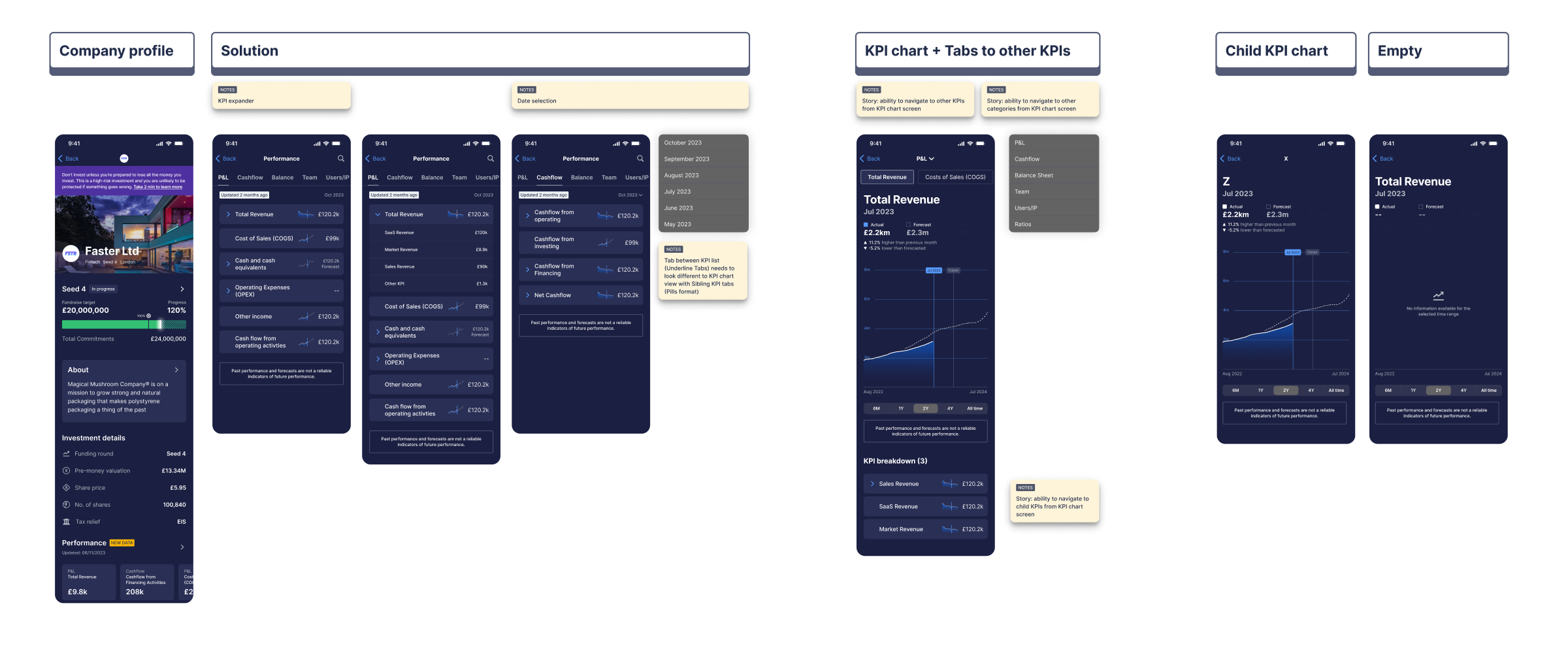
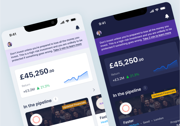
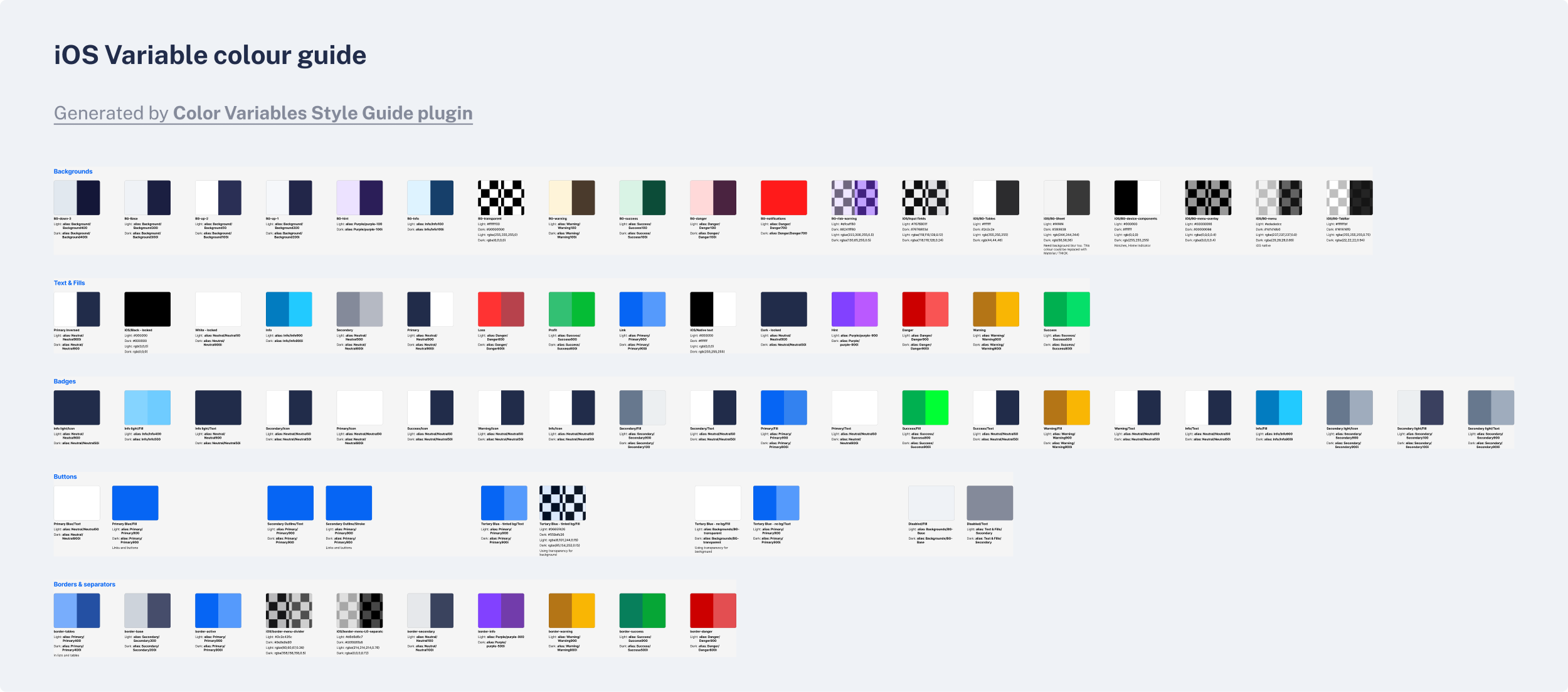
Light and Dark mode
The team debated for a long time whether we should introduce light and dark mode in to the app. One side of the argument is that as a startup, we should work lean, move fast and aim to learn, while on the other side, we should consider the accessibility of the app, it was finally decided to implement light and dark mode. In order to do so, we had to ensure it was done systematically, leveraging how Xcode handles colour theming.
At this point, there never had been the concept of light and dark mode on any of Floww’s platform where a mix of light and dark interface were used together. Fortunately, Figma had just released variables at this point and we were able to iterate quickly. Establishing a thorough Figma colour and component design system.
Version 2 – Looking great and working smoothly
After months of design and research into user needs, gaining a thorough understanding of our target audience and providing a user-friendly experience, we were able to launch version 2 of the app, a renewed look to the app. Although the app remain in it’s infancy, we were already able to observe an increase in engaging and investments made on the app. We have also receive many positive feedback from the current user base on the improvements we have made.