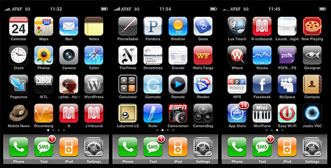
The app grid approach for smartphones has been around since the first iPhone (released June 2007) and most people are rather happy with this way of doing things. The problem with this approach is that it makes a number of assumptions:
- Users can remember what the icon looks like (or that we read the app labels)
- Users have a good idea of how our app icons are organised
- Users are organised
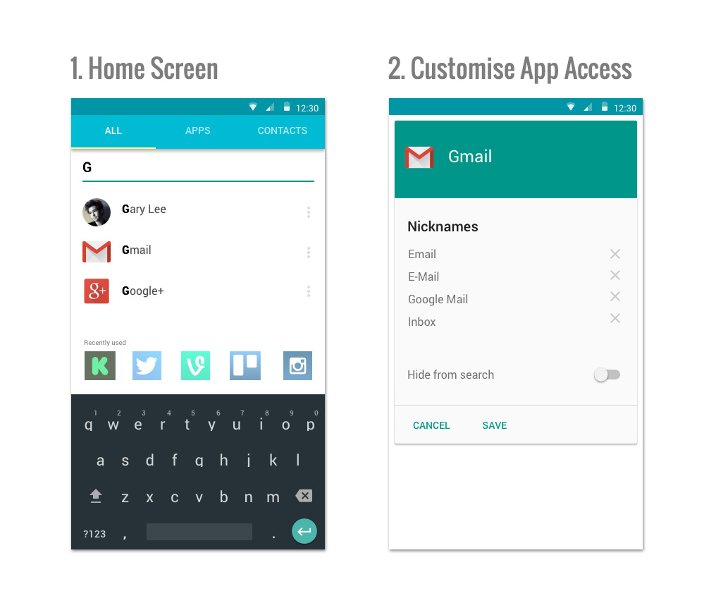
Now what if instead of the usual grid app, we take a different approach, we actually ask the users to type in which app they want? If I need Gmail, I would simply unlock my phone and click on “G” on the keyboard and all the relevant apps would come up. Maybe you can even customise each app, so that if you type in “email” Gmail would also show up. This is of course very similar to the search function on iOS and Android, my question is whether this would work better as the primary form of interaction. It’s similar to programmers who operates 90% of the desktop using shortcut keys (Such as launching an app from Spotlight)

My assumptions
- Users can remember the name of an app
- Users don’t mind typing
- Users are organise (giving app nicknames, hiding/favouriting apps)
The benefit
- No more scrolling through 20 pages of app icons trying to find an app
- When we add/delete apps, we will no longer be confused by change of app icon locations
I would be very curious to see whether this interface would make any difference, maybe an alphabetical scroll bar would help, adding a backup to access by grid might also be nice. A list of “favourites” (not shown in the mock up) might also help… I think this would be an interesting experiment, but what do you think? Is it just a silly idea? Please comment below